A concept UI design for managing updates in the upcoming Battlefield 6
Battlefield
AuGust 2025
On going
Role: uix/ui Designer
Introduction
Battlefield 6 Update Interfaces
A concept UI design for Battlefield 6’s updates, built to give players a smoother, more intuitive way to explore seasonal updates, new maps, modes, weapons, and cosmetics.
Challenge
Design a simple, intuitive UI for Battlefield 6 that lets players quickly find and access seasonal updates while maintaining the Battlefield identity.
Design process
Design Principles
Design principles applied throughout the design process.
Hierarchy
Guide the viewer’s attention by prioritizing elements—use size, color, spacing, and typography to emphasize what matters most.
Contrast
Use contrasting colors, fonts, and sizes to create visual interest and improve readability to improve accessibility.
Brand Consistency
Stick to a visual language, typography, colors, spacing and style to create cohesion.
Audience
Information is well-prioritized using size, contrast, and layout, guiding users to the most important tasks quickly.
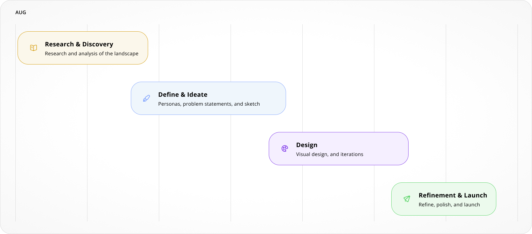
Project timeline
Introducing
Update Interfaces Concepts
This ongoing project is something I’m passionate about. These first concepts focus on blending simplicity with Battlefield 6’s signature style, creating an intuitive and seamless way for players to access seasonal updates.
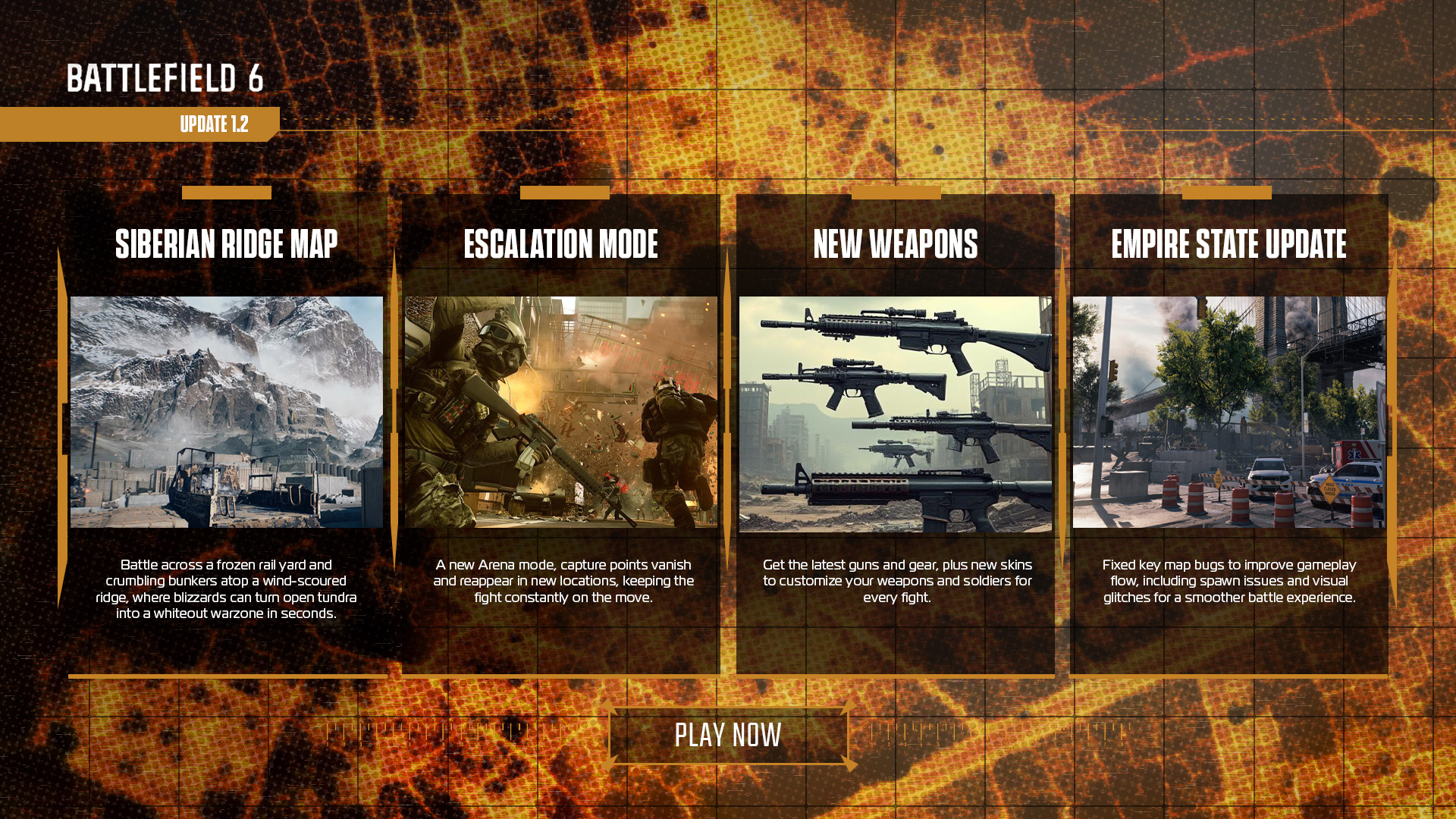
Update Concept 1
Key Features —
A clear, visually organized update dashboard that highlights new content across maps, modes, weapons, and bug fixes, allowing players to quickly scan and jump into game.
Clear Visual Hierarchy
Content is organized with bold headings and balanced spacing, making it easier to scan and digest at a glance.
Consistent Branding
The consistent use of the rigid military style with a hint of modern technology graphics to tie the whole concept together.
Call to Action
The clean, minimal layout paired with a call to action button that does not differ player's eyes away from the main focal point.
Considerations
Designing For Everyone
Here are a few accessibility-focused elements that were explored and applied.
Legible Typography
Clear, well-sized fonts improve readability for everyone, especially those with visual or cognitive differences
Color Contrast
Text and icons contrast well against their backgrounds, improving legibility for users with low vision or color blindness.
final notes
Lessons Learned
I’m really excited about this ongoing Battlefield 6 UI concept project, it’s been a great challenge to create a design that feels true to the game’s spirit while making updates easy and enjoyable to access. There’s still so much more to explore and improve, and I can’t wait to share new ideas and refinements as the project evolves. This is just the beginning, and I’m passionate about pushing the experience even further.


.png)